-
3월 7일 복습그린컴퓨터디자인 학원 복습 및 정리 2025. 3. 7. 21:11

Figma 화면 Auto Layout → CSS Flex box
position: relative; → Auto Layout 적용 시 Position 값은 relative 이다.
flex-direction → frame의 위치에 따라 row 또는 column으로 설정 가능하다.
div 박스 → block 레벨
Clip content를 해제하면 박스를 벗어나도 보인다.
Plugin Unsplash를 이용하면 이미지를 삽입할 수 있다.
더미 이미지를 삽입할 때 Lorem Picsum을 사용할 수 있으며, 이미지 주소를 넣으면 사용할 수 있다.
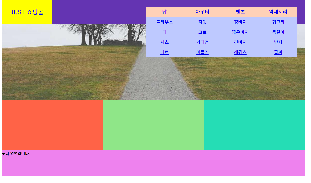
<!DOCTYPE html>
<html lang="ko">
  <head>
    <meta charset="UTF-8" />
    <meta name="viewport" content="width=device-width, initial-scale=1.0" />
    <title>A-1 유형</title>
    <link rel="stylesheet" href="css/style.css" />
    <!-- <script src="javascript/script.js"></script> -->
  </head>
  <body>
    <div class="wrap">
      <header class="header">
        <a href="#" class="logo">JUST 쇼핑몰</a>
        <nav class="menu">
          <ul class="navi">
            <li>
              <a href="#">탑</a>
              <ul class="submenu">
                <li><a href="#">블라우스</a></li>
                <li><a href="#">티</a></li>
                <li><a href="#">셔츠</a></li>
                <li><a href="#">니트</a></li>
              </ul>
            </li>
            <li>
              <a href="#">아우터</a>
              <ul class="submenu">
                <li><a href="#">자켓</a></li>
                <li><a href="#">코트</a></li>
                <li><a href="#">가디건</a></li>
                <li><a href="#">머플러</a></li>
              </ul>
            </li>
            <li>
              <a href="#">팬츠</a>
              <ul class="submenu">
                <li><a href="#">청바지</a></li>
                <li><a href="#">짧은바지</a></li>
                <li><a href="#">긴바지</a></li>
                <li><a href="#">레깅스</a></li>
              </ul>
            </li>
            <li>
              <a href="#">악세서리</a>
              <ul class="submenu">
                <li><a href="#">귀고리</a></li>
                <li><a href="#">목걸이</a></li>
                <li><a href="#">반지</a></li>
                <li><a href="#">팔찌</a></li>
              </ul>
            </li>
          </ul>
        </nav>
      </header>

      <main class="main">
        <div class="img-slide">
          <ul class="slide-list">
            <li>
              <a href="#">
                <img
                  src="https://picsum.photos/1200/300?random=1"
                  alt="이미지-1"
                />
              </a>
            </li>
            <li>
              <a href="#">
                <img
                  src="https://picsum.photos/1200/300?random=2"
                  alt="이미지-2"
                />
              </a>
            </li>
            <li>
              <a href="#">
                <img
                  src="https://picsum.photos/1200/300?random=3"
                  alt="이미지-3"
                />
              </a>
            </li>
          </ul>
        </div>
        <div class="contents">
          <div class="gallery"></div>
          <div class="banner"></div>
          <div class="shortcut"></div>
        </div>
      </main>

      <footer class="footer">푸터 영역입니다.</footer>
    </div>
  </body>
</html>
index.html
/* 기본 스타일 초기화 */
* {
  margin: 0;
  padding: 0;
  box-sizing: border-box;
}
ul,
ol {
  list-style: none;
}
img {
  vertical-align: middle;
  border: 0;
}

.wrap {
  width: 1200px;
  height: 700px;
  background-color: #ddd;
  margin: 0 auto;
}
.header {
  position: relative;
  width: 100%;
  height: 100px;
  background-color: aqua;
  display: flex;
}
.logo {
  position: relative;
  width: 200px;
  height: 100%;
  background-color: yellow;
  display: flex;
  justify-content: center;
  align-items: center;
  font-size: 24px;
}
.menu {
  position: relative;
  width: 1000px;
  height: 100%;
  background-color: rgb(100, 52, 178);
  display: flex;
  justify-content: flex-end;
  align-items: center;
  padding-right: 30px;
}
.navi {
  position: relative;
  display: flex;
}
.navi > li {
  position: relative;
}
.navi > li > a {
  display: block;
  width: 150px;
  height: 40px;
  font-size: 20px;
  text-align: center;
  line-height: 40px;
  background-color: #ffd1b7;
}

.submenu {
  position: absolute;
  top: 40px;
  left: 0px;
  z-index: 1;
  /* display: none; */
}
.submenu li {
}
.submenu li a {
  display: block;
  width: 150px;
  height: 40px;
  font-size: 18px;
  line-height: 40px;
  text-align: center;
  background-color: #bec9ff;
}

.main {
  position: relative;
  width: 100%;
  height: 500px;
  background-color: bisque;
}
.img-slide {
  position: relative;
  width: 100%;
  height: 300px;
  overflow: hidden;
}
.slide-list {
  position: relative;
  width: 100%;
  height: 300%;
}
.slide-list li {
}
.slide-list li a {
}
.slide-list li a img {
}
.contents {
  position: relative;
  width: 100%;
  height: 200px;
  background-color: azure;
  display: flex;
}
.gallery {
  position: relative;
  width: 400px;
  height: 100%;
  background-color: tomato;
}
.banner {
  position: relative;
  width: 400px;
  height: 100%;
  background-color: rgba(109, 221, 94, 0.74);
}
.shortcut {
  position: relative;
  width: 400px;
  height: 100%;
  background-color: rgb(37, 221, 181);
}
.footer {
  width: 100%;
  height: 100px;
  background-color: violet;
}
Contents 박스 안에 3개가 나란히 올 수 있도록 display: flex
html 태그 중 img 태그는 이미지를 삽입할 수 있고, 태그 안에 alt는 속성, 설명인데 비워두지는 않는다.
CSS에서 클래스네임 없으면, 바로 태그를 찍으면 된다.
'그린컴퓨터디자인 학원 복습 및 정리' 카테고리의 다른 글
3월 11일 복습 (1) 2025.03.11 3월 10일 복습- main > contents > banner, shortcut 그리기와 HTML, CSS 작성 (0) 2025.03.10 3월 6일 복습 (0) 2025.03.06 3월 5일 복습 (1) 2025.03.05 2025 웹디자인개발기능사 A-1 유형 와이퍼프레임 구조 짜기 (0) 2025.03.05