3월 11일 복습
figma에서 텍스트 가운데로 정렬할 때 auto 쓰면 되지만,
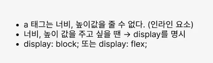
코드를 쓸때는 display : flex가 아닌 경우에는 a 태그는 너비, 높이값을 줄 수 없다.
text-align : center ; → 너비 가득채우기 → 박스와 같은 줄간격 적용
display: flex; 를 써야 justify-content와 align-items을 쓸 수 있다.
display: block; 인 상태는 text-align: center; , line-height를 똑같이 가져가야 한다.
li에는 너비, 높이를 잘 안 준다.
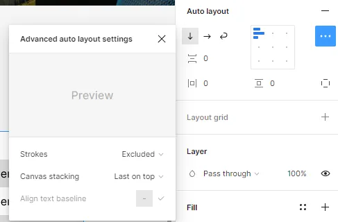
피그마에서 레이어 보이는 순서를 변경할 수 있는데 Auto layout이 설정되어 있으면 고급 설정에서 변경할 수 있다.
(기본적으로 아래에 있는 것을 먼저 보여준다.)
그리고 선까지 포함할 것인지 말 것인지도 설정해 줄 수 있다.
플러그인 Lorem Ipsum을 주면 더미 텍스트를 쓸 수 있다.
플러그인 anima를 쓰면 코드로 변환할 수 있다. (전부 div로 나오기 때문에 비추, 태그 수정해야 함)
VScode html에서 작성할 때 클래스를 작성할 때 .tabmenu로 작성하면 클래스로 작성,
#tabmenu로 하면 ID로 작성된다.
VScode에서 html 문서를 작성할 때 ul>li*2를 입력하면 ul 태그에 li 태그 2개가 붙는다.
ctrl+enter: 태그를 거치지 않고 바로 줄바꿈이 된다.
lorem5라고 입력하면 5단어만 입력된다.
VScode 플러그인 Text marker(Highlight) - Ryuichi Inagaki를 이용하면 형광펜 마크 처리를 할 수 있다.
<!DOCTYPE html>
<html lang="ko">
<head>
<meta charset="UTF-8" />
<meta name="viewport" content="width=device-width, initial-scale=1.0" />
<title>A-1 유형</title>
<link rel="stylesheet" href="css/style.css" />
<!-- <script src="javascript/script.js"></script> -->
</head>
<body>
<div class="wrap">
<header class="header">
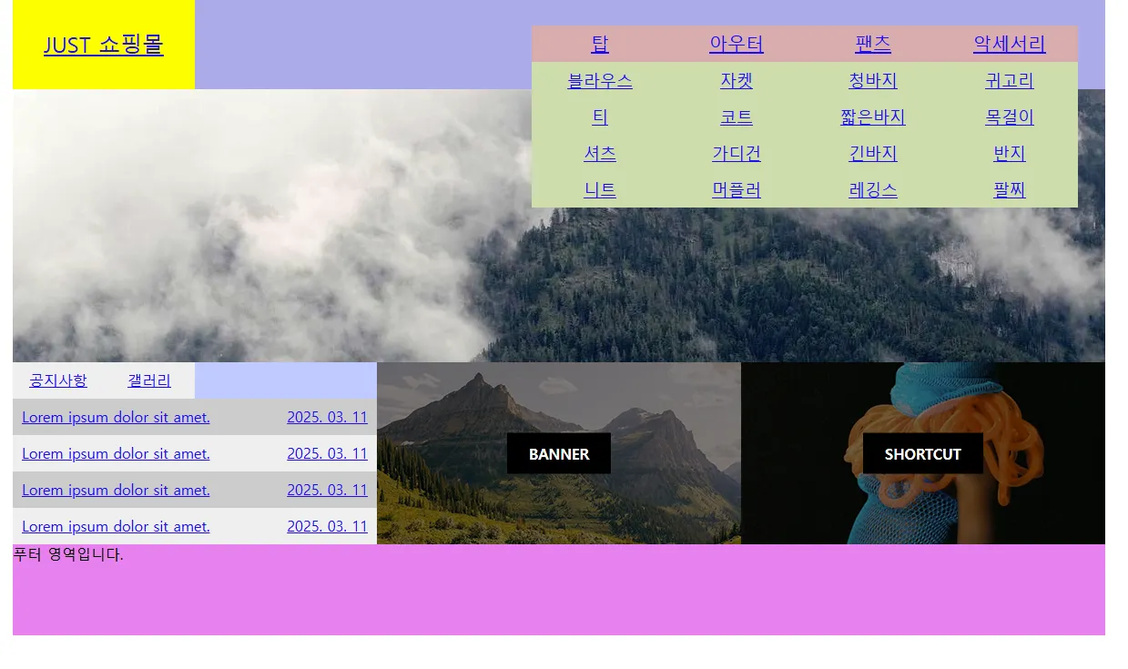
<a href="#" class="logo">JUST 쇼핑몰</a>
<nav class="menu">
<ul class="navi">
<li>
<a href="#">탑</a>
<ul class="submenu">
<li><a href="#">블라우스</a></li>
<li><a href="#">티</a></li>
<li><a href="#">셔츠</a></li>
<li><a href="#">니트</a></li>
</ul>
</li>
<li>
<a href="#">아우터</a>
<ul class="submenu">
<li><a href="#">자켓</a></li>
<li><a href="#">코트</a></li>
<li><a href="#">가디건</a></li>
<li><a href="#">머플러</a></li>
</ul>
</li>
<li>
<a href="#">팬츠</a>
<ul class="submenu">
<li><a href="#">청바지</a></li>
<li><a href="#">짧은바지</a></li>
<li><a href="#">긴바지</a></li>
<li><a href="#">레깅스</a></li>
</ul>
</li>
<li>
<a href="#">악세서리</a>
<ul class="submenu">
<li><a href="#">귀고리</a></li>
<li><a href="#">목걸이</a></li>
<li><a href="#">반지</a></li>
<li><a href="#">팔찌</a></li>
</ul>
</li>
</ul>
</nav>
</header>
<main class="main">
<div class="img-slide">
<ul class="slide-list">
<li>
<a href="#">
<img
src="https://picsum.photos/1200/300?random=1"
alt="이미지-1"
/>
</a>
</li>
<li>
<a href="#">
<img
src="https://picsum.photos/1200/300?random=2"
alt="이미지-2"
/>
</a>
</li>
<li>
<a href="#">
<img
src="https://picsum.photos/1200/300?random=3"
alt="이미지-3"
/>
</a>
</li>
</ul>
</div>
<div class="contents">
<!-- 탭 메뉴 영역 -->
<div class="tabmenu">
<ul>
<li class="active">
<a href="#">공지사항</a>
<div class="notice">
<ul>
<li>
<a href="#">
Lorem ipsum dolor sit amet.
<span>2025. 03. 11</span>
</a>
</li>
<li>
<a href="#">
Lorem ipsum dolor sit amet.
<span>2025. 03. 11</span>
</a>
</li>
<li>
<a href="#">
Lorem ipsum dolor sit amet.
<span>2025. 03. 11</span>
</a>
</li>
<li>
<a href="#">
Lorem ipsum dolor sit amet.
<span>2025. 03. 11</span>
</a>
</li>
</ul>
</div>
</li>
<li>
<a href="#">갤러리</a>
<div class="gallery">
<ul>
<li>
<a href="#">
<img src="images/gallery-1.png" alt="갤러리1" />
</a>
</li>
<li>
<a href="#">
<img src="images/gallery-2.png" alt="갤러리2" />
</a>
</li>
<li>
<a href="#">
<img src="images/gallery-3.png" alt="갤러리3" />
</a>
</li>
</ul>
</div>
</li>
</ul>
</div>
<!-- 배너 영역 -->
<div class="banner">
<img src="images/banner.png" alt="배너" />
<div class="filter-bg"></div>
<span>BANNER</span>
</div>
<!-- 바로가기 영역 -->
<div class="shortcut">
<img src="images/shortcut.png" alt="바로가기" />
<div class="filter-bg"></div>
<span>SHORTCUT</span>
</div>
</div>
</main>
<footer class="footer">푸터 영역입니다.</footer>
</div>
</body>
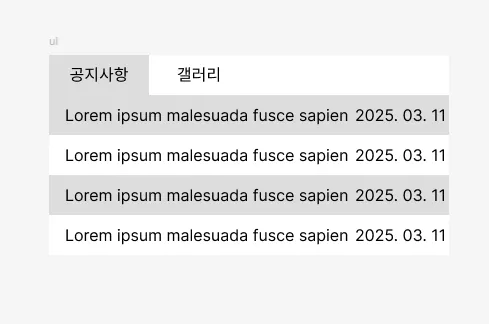
</html>공지사항에서 span 태그를 이용해서 공지사항과 날짜를 분리한다.
/* 기본 스타일 초기화 */
* {
  margin: 0;
  padding: 0;
  box-sizing: border-box;
}
ul,
ol {
  list-style: none;
}
img {
  vertical-align: middle;
  border: 0;
}

.wrap {
  width: 1200px;
  height: 700px;
  background-color: #ddd;
  margin: 0 auto;
}
.header {
  position: relative;
  width: 100%;
  height: 100px;
  background-color: aqua;
  display: flex;
}
.logo {
  position: relative;
  width: 200px;
  height: 100%;
  background-color: yellow;
  display: flex;
  justify-content: center;
  align-items: center;
  font-size: 24px;
}
.menu {
  position: relative;
  width: 1000px;
  height: 100%;
  background-color: rgb(170, 171, 230);
  display: flex;
  justify-content: flex-end;
  align-items: center;
  padding-right: 30px;
}
.navi {
  position: relative;
  display: flex;
}
.navi > li {
  position: relative;
}
.navi > li > a {
  display: block;
  width: 150px;
  height: 40px;
  font-size: 20px;
  text-align: center;
  line-height: 40px;
  background-color: #dcadad;
}

.submenu {
  position: absolute;
  top: 40px;
  left: 0;
  z-index: 1;
  /* display: none; */
}
.submenu li {
}
.submenu li a {
  display: block;
  width: 150px;
  height: 40px;
  font-size: 18px;
  line-height: 40px;
  text-align: center;
  background-color: #cddcad;
}

.main {
  position: relative;
  width: 100%;
  height: 500px;
  background-color: bisque;
}
.img-slide {
  position: relative;
  width: 100%;
  height: 300px;
  overflow: hidden;
}
.slide-list {
  position: relative;
  width: 100%;
  height: 300%;
}
.slide-list li {
}
.slide-list li a {
}
.slide-list li a img {
}

.contents {
  position: relative;
  width: 100%;
  height: 200px;
  display: flex;
}
.tabmenu {
  position: relative;
  width: 400px;
  height: 100%;
  background-color: #bec9ff;
}
.tabmenu > ul {
  position: relative;
  width: 100%;
  height: 100%;
}
.tabmenu > ul > li {
  position: absolute;
  top: 0;
  left: 0;
}
.tabmenu > ul > li > div {
  display: none;
}
.tabmenu > ul > li.active > div {
  position: absolute;
  top: 40px;
  left: 0;
  display: block;
  width: 400px;
  height: 160px;
}
.tabmenu > ul > li > a {
  position: absolute;
  top: 0;
  left: 0;
  display: block;
  width: 100px;
  line-height: 40px;
  text-align: center;
  background-color: #eee;
}
.tabmenu > ul > li:last-child > a {
  left: 100px;
}
.notice {
}
.notice ul {
  position: relative;
  width: 100%;
  height: 100%;
}
.notice ul li {
}
.notice ul li a {
  display: flex;
  width: 100%;
  line-height: 40px;
  justify-content: space-between;
  padding: 0 10px;
  background-color: #eee;
}
.notice ul li:nth-child(odd) a {
  background-color: #ccc;
}
.notice ul li a span {
}

.gallery {
}
.gallery ul {
  position: relative;
  width: 100%;
  height: 100%;
  display: flex;
  justify-content: center;
  align-items: center;
  gap: 24px;
  background-color: #eee;
}
.gallery ul li {
}
.gallery ul li a {
}
.gallery ul li a img {
}

.banner {
  position: relative;
  width: 400px;
  height: 100%;
  background-color: #c153ec;
}
.banner img {
}
.banner .filter-bg {
  position: absolute;
  left: 0;
  top: 0;
  width: 400px;
  height: 200px;
  background-color: rgba(0, 0, 0, 0.5);
}
.banner span {
  position: absolute;
  left: 50%;
  top: 50%;
  padding: 12px 24px;
  background-color: rgba(0, 0, 0, 1);
  color: #fff;
  font-weight: bold;
  transform: translate(-50%, -50%);
}
.shortcut {
  position: relative;
  width: 400px;
  height: 100%;
  background-color: #16e77f;
}
.shortcut img {
}
.shortcut .filter-bg {
  position: absolute;
  left: 0;
  top: 0;
  width: 400px;
  height: 200px;
  background-color: rgba(0, 0, 0, 0.5);
}
.shortcut span {
  position: absolute;
  left: 50%;
  top: 50%;
  padding: 12px 24px;
  background-color: rgba(0, 0, 0, 1);
  color: #fff;
  font-weight: bold;
  transform: translate(-50%, -50%);
}
.footer {
  width: 100%;
  height: 100px;
  background-color: violet;
}
https://codepen.io/qikddukq-the-flexboxer/pen/zxYEbbe
tabmenu
...
codepen.io
:nth-child(N)= 부모안에 모든 요소 중 N번째 요소
:last-child= 부모안에 모든 요소 중 마지막 요소
justify-content: space-between; : 사이에 균일한 간격을
만들어준다.
:nth-child(odd) : 홀수
CSS는 같은 속성이 있을 때 마지막에 쓴 걸 덮어쓴다.