3월 10일 복습- main > contents > banner, shortcut 그리기와 HTML, CSS 작성
Figma 저장
왼쪽 상단- file- save local copy
노션 웹클리핑 하는 방법
크롬 웹스토어 검색- notion - Notion Web Clipper
CODEPEN 사용해서 코드랑 화면 동시에 볼 수 있음. (다른 사람 코드도 참고 가능)
CODEPEN 설정에서 Autocomplete 체크(Editor Preferences)
CODEPEN 노션 공유 시
링크 복사 - 노션에서 ctrl+v - CODEPEN 임베드 클릭
콘텐츠 영역 만들기
- 클래스 네임
- 오토 레이아웃
- 너비 설정
- Gap,Padding
이미지 넣는 방법
- CSS에 박스배경으로 삽입
- html 이미지 태그로 삽입
Figma에서 이미지 넣을 때 Rectangle 사용→이미지 삽입
Figma에서 alt+다른 박스 커서를 대면 박스 사이 간격이 나온다.
absolute 쓰면 그 하위박스는 오토 레이아웃 무시, 박스를 겹칠 수 있다.
Figma에서 이미지 저장할 때 Design - Export
span: html 태그 중 하나로, 박스 안에 특정 글자를 선택하고 싶을 때 사용
ex) 안녕하세요! 반갑습니다에서 반갑습니다만 변경할 때 span 태그 안에 반갑습니다 쓰고
CSS에서 span 태그에서 색상 등 속성 변경
br: html 줄바꿈
이미지 쨍할 때(흐릿하게 있다 마우스 올려있을 때 진해졌으면 했을 때)
이미지 위에 아무것도 없을 때 검은 박스 만들어서 투명도 낮춰서 올리기
- CSS 박스 속성 이용
- html 이용
<!DOCTYPE html>
<html lang="ko">
<head>
<meta charset="UTF-8" />
<meta name="viewport" content="width=device-width, initial-scale=1.0" />
<title>A-1 유형</title>
<link rel="stylesheet" href="css/style.css" />
<!-- <script src="javascript/script.js"></script> -->
</head>
<body>
<div class="wrap">
<header class="header">
<a href="#" class="logo">JUST 쇼핑몰</a>
<nav class="menu">
<ul class="navi">
<li>
<a href="#">탑</a>
<ul class="submenu">
<li><a href="#">블라우스</a></li>
<li><a href="#">티</a></li>
<li><a href="#">셔츠</a></li>
<li><a href="#">니트</a></li>
</ul>
</li>
<li>
<a href="#">아우터</a>
<ul class="submenu">
<li><a href="#">자켓</a></li>
<li><a href="#">코트</a></li>
<li><a href="#">가디건</a></li>
<li><a href="#">머플러</a></li>
</ul>
</li>
<li>
<a href="#">팬츠</a>
<ul class="submenu">
<li><a href="#">청바지</a></li>
<li><a href="#">짧은바지</a></li>
<li><a href="#">긴바지</a></li>
<li><a href="#">레깅스</a></li>
</ul>
</li>
<li>
<a href="#">악세서리</a>
<ul class="submenu">
<li><a href="#">귀고리</a></li>
<li><a href="#">목걸이</a></li>
<li><a href="#">반지</a></li>
<li><a href="#">팔찌</a></li>
</ul>
</li>
</ul>
</nav>
</header>
<main class="main">
<div class="img-slide">
<ul class="slide-list">
<li>
<a href="#">
<img
src="https://picsum.photos/1200/300?random=1"
alt="이미지-1"
/>
</a>
</li>
<li>
<a href="#">
<img
src="https://picsum.photos/1200/300?random=2"
alt="이미지-2"
/>
</a>
</li>
<li>
<a href="#">
<img
src="https://picsum.photos/1200/300?random=3"
alt="이미지-3"
/>
</a>
</li>
</ul>
</div>
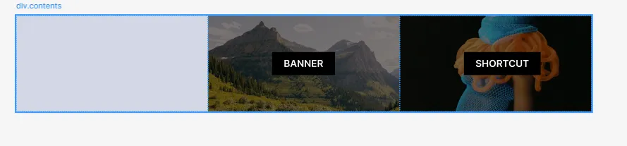
<div class="contents">
<!-- 탭 메뉴 영역 -->
<div class="tabmenu"></div>
<!-- 배너 영역 -->
<div class="banner">
<img src="images/banner.png" alt="배너" />
<div class="filter-bg"></div>
<span>BANNER</span>
</div>
<div class="shortcut">
<!-- 바로가기 영역 -->
<img src="images/shortcut.png" alt="바로가기" />
<div class="filter-bg"></div>
<span>SHORTCUT</span>
</div>
</div>
</main>
<footer class="footer">푸터 영역입니다.</footer>
</div>
</body>
</html>index.html
/* 기본 스타일 초기화 */
* {
  margin: 0;
  padding: 0;
  box-sizing: border-box;
}
ul,
ol {
  list-style: none;
}
img {
  vertical-align: middle;
  border: 0;
}

.wrap {
  width: 1200px;
  height: 700px;
  background-color: #ddd;
  margin: 0 auto;
}
.header {
  position: relative;
  width: 100%;
  height: 100px;
  background-color: aqua;
  display: flex;
}
.logo {
  position: relative;
  width: 200px;
  height: 100%;
  background-color: yellow;
  display: flex;
  justify-content: center;
  align-items: center;
  font-size: 24px;
}
.menu {
  position: relative;
  width: 1000px;
  height: 100%;
  background-color: rgb(170, 171, 230);
  display: flex;
  justify-content: flex-end;
  align-items: center;
  padding-right: 30px;
}
.navi {
  position: relative;
  display: flex;
}
.navi > li {
  position: relative;
}
.navi > li > a {
  display: block;
  width: 150px;
  height: 40px;
  font-size: 20px;
  text-align: center;
  line-height: 40px;
  background-color: #dcadad;
}

.submenu {
  position: absolute;
  top: 40px;
  left: 0;
  z-index: 1;
  /* display: none; */
}
.submenu li {
}
.submenu li a {
  display: block;
  width: 150px;
  height: 40px;
  font-size: 18px;
  line-height: 40px;
  text-align: center;
  background-color: #cddcad;
}

.main {
  position: relative;
  width: 100%;
  height: 500px;
  background-color: bisque;
}
.img-slide {
  position: relative;
  width: 100%;
  height: 300px;
  overflow: hidden;
}
.slide-list {
  position: relative;
  width: 100%;
  height: 300%;
}
.slide-list li {
}
.slide-list li a {
}
.slide-list li a img {
}

.contents {
  position: relative;
  width: 100%;
  height: 200px;
  display: flex;
}
.tabmenu {
  position: relative;
  width: 400px;
  height: 100%;
  background-color: #bec9ff;
}
.banner {
  position: relative;
  width: 400px;
  height: 100%;
  background-color: #c153ec;
}
.banner img {
}
.banner .filter-bg {
  position: absolute;
  left: 0;
  top: 0;
  width: 400px;
  height: 200px;
  background-color: rgba(0, 0, 0, 0.5);
}
.banner span {
  position: absolute;
  left: 50%;
  top: 50%;
  padding: 12px 24px;
  background-color: rgba(0, 0, 0, 1);
  color: #fff;
  font-weight: bold;
  transform: translate(-50%, -50%);
}
.shortcut {
  position: relative;
  width: 400px;
  height: 100%;
  background-color: #16e77f;
}
.shortcut img {
}
.shortcut .filter-bg {
  position: absolute;
  left: 0;
  top: 0;
  width: 400px;
  height: 200px;
  background-color: rgba(0, 0, 0, 0.5);
}
.shortcut span {
  position: absolute;
  left: 50%;
  top: 50%;
  padding: 12px 24px;
  background-color: rgba(0, 0, 0, 1);
  color: #fff;
  font-weight: bold;
  transform: translate(-50%, -50%);
}
.footer {
  width: 100%;
  height: 100px;
  background-color: violet;
}
style.css
https://codepen.io/qikddukq-the-flexboxer/pen/ByadVpX
banner, shortcut
...
codepen.io
배너 상자 50%만큼 오른쪽, 아래로 옮기고, 왼쪽 50%, 위로 50% 옮기면 가운데에 위치하게 된다.
자기자신을 이동시킬 때 transform(변형)에서 translate 사용
span 태그 이미지와 겹쳐 가운데 위치하기
position: absolute; 절대좌표 적용
left: 50%; x축으로 50% 띄워서 위치
top: 50%; y축으로 50% 띄워서 위치
transform: translate(-50%, -50%); 자신의 너비, 높이의 -50%씩 만큼 이동